
| Intuitive Understanding In most of the wireless communication environement, a signal out of a transmitter radiate into wide direction and these radiated signal takes different path and arriving at the reciever at different timing and with different signal strength(amplitude). As a result, the signal coming into the reciever is the composite of all the components. As you may learned in high school physics, when thetwo copies of the signal get combined the resulting signal can be an augmented signal or attenuated signal depending on whether the two signal constructively combined or destructively combined. Then what determines whether the signals constructively combine or destructively combine ? The answer also come from high school physics. The phase of the two signal determines whether the signal constructively combine or destructively combine.
In wireless communication environment, many copies of the signals get combined at the reciever side and some of them constructively combines and some of them destructively combines. So final result of combination of all the incoming signals become very complicated and the combined signal becomes drastically different from the original signal tranmitted from the source. In most case, the quality of the combined signal at the reciever gets poorer (deteriorated) than the original signal. This kind of process of signal deterioration by the multiple propogation path of a signal is called ‘Fading’. When we say “Fading”, it usually implies “Signal quality gets bad”.
For more intuitive unerstanding of the fading, I will show you a couple of different aspect of fading you can mesure using various equipments.
First, let’s compare a faded signal and non-faded signal using a spectrum analyzer. You would get the two results as follows and you will see the highly fluctuating amplitude across the channel bandwidth. (Note : These two capture are not the one from the same signal, so comparing the absolute value of the amplitude does not many any sense. Just take the image of overall amplitude profile).
Now let’s look at how the fading influence the signal quality decoded by the reciever. Look at the following samples of constellation for faded and non-faded signal.
Now let’s get into even further and I think this is the thing that you would be most interested in. How this fading would influence the final performance. Following graph shows the data rate at PHY layer and PDCP layer. The plot showing at the top (labeled as ‘PHY Transmission Rate’) is the amount of data being transmitted per second by PHY layer of the transmitter. The plot in the middle (labeled as ‘PHY throughput with HARQ ACK’ is the amount of data getting ACKED per second from the reiever PHY layer. You see there is pretty much gap between the two plots. It means that a considerable portions of the data were failed to get properly decoded by the reciever and the reciever sent NACK for the data. Normally in this case, the transmitter PHY layer retransmits the previous data rather than moving into the next step of the transmission. The plot at the bottom (labelled as ‘PDCP Transmission Rate’) is the amount of data being sent to the lower layer from the transmitter’s PDCP layer. You will see another gap here. It is not easy to explain exactly what is causing this gap. In this case, some portions of the gap would come from the overhead of higher layer data structure but majority of the gap would be because PDCP cannot push the data down to the lower layer since PHY layer is too busy with retransmitting the previous data rather than transmitting the new data coming from the higher layer.
Major Components of Fading
There are many factors generating Fading effect. Followings are the list of components (factors) of fading we can think of.
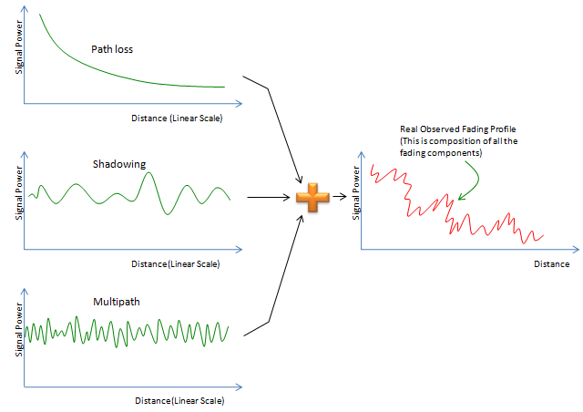
To study on fading requires the detailed understanding of each of these components. If I express some major components in visual form, it can be presented as follows. Just from the high level view, you should see some typtical pattern from this representation. First notice that the horizontal axis represents ‘Distance in Linear Scale’. You may have seen a lot of different plots in various textbook and get confused by those. One of the first step to remove those confusion would be clearly understanding the meaning of axis of the graph. Even for the same things, you would see different shape of plots if you define the meaning of the axis differently. One of the factors from various text confusing you the most is the scale of each axis. For example, in case of path loss graph in some textbook where they represent the axis in log scale you would see a straight line, but in this page you are seeing a kind of negative exponential graph since the axis is represented in linear scale.
Now let’s look into each of the graphs. Path loss is just gradually decreases but not much of fluctuation. In the second plot, you see some fluctuation of the signal strength but the fluctuation frequency over the distance is not that high. In the third plot, you see fluctuations of signal strength and the fluctuation frequency is also pretty high. When you observe a real received signal, you wouldn’t see these factors in separate form as in the graph on the left side. What you see at the real reciever is the result of summation of all the factors and it is like the graph on the right side.
Path Loss and Shadowing
Path Loss and Shadowing may not be considered to be a part of Fading in narrow sense, but it can be considered as a factor causing the fading in wider sense. Understanding or Modeling the path loss is not that difficult. You may see a mathematical model which you were faimilar with in your high school math. The famous format of anti-proportional to ‘something squared’.
Modling for Path Loss is done with the respect to the distance between a transmitter and receiver. The key question is .. Test A) When a transmitter antenna is transmitting a certain (fixed) amount of energy and you put a measurement antenna which is a certain distance (let’s call this distance as ‘d’) and measure the received(measured) energy. Once you get the value at a certain ‘d’, write down the value. And then move the reciever antenna a little bit further and do the same measurement and write down the value. Repeat this process as you move ‘d’ further and further and collect all the measured value and plot it on the graph with horizontal axis = d and vertical axis = measured energy level (power). How would the plot look like ? Can you come up with an equation to represent the graph ?
Test B) Now let’s try a little bit different type of measurement. This time, draw a circle with radius d with the transmitter antenna at the center. and then put several antenna along the circumference and measure the received power at each antenna and plot the value with horizontal axis = location of receiver antenna and vertical axis = measured energy level (power). How would the plot look like ?
Test C) Now let’s think about two test environment. In one setup there is no obstacles between the reciever and transmitter antenna (Let’s call this as ‘Setup A’). In the other setup, there are a lot of obstacles (like building, tree, houses, mountain etc) between the transmitter antenna and reciever antenna (Let’s call this as ‘Setup B’). Then you do the measurement described in Test B) for both setup and compare the result. Would you see any difference ? what kind of difference would you see ?
These three test will be used as a basis for modeling following cases. (Details will come later)
< Path Loss Mode in Free Space >
< Path Loss Mode in Real Situation : Shadowing >
Channels with MultiPath
A defining characteristic of the mobile wireless channel is to build up a mathematical model for the variations of the channel strength over time and over frequency. There are mainly two factors influencing the variations of the channel strength as listed below.
As a starting point, please… please … please … read very carefully about the section of Signal Presentation, Impulse Response and Convolution section before you go deeper into this section.
Let’s suppose we have a case as shown below. A UE is communicating with a eNodeB and there is a lot of building between the UE and the eNodeB. You may intuitively guess the eNodeB would get the multiple copies of the same signal from UE because the same signal can reach the eNodeB via multiple path as shown below. Let’s assume that we have four different path as shown below. There are two major characteristics of the paths. One is attenuation and the other one is time delay. Of course there would be several additional factors, but these two components would be the largest factors. Let’s assume that each of the path has the delay and attenuation as shown below.
How do we represent a channel using these delay and attenuator factor ? There can be a couple of different ways to represent it, but one of the most common way would be to represent it as an impulse response model. Even though you may not familiar with the term ‘impulse response’, you may have seen this kind of description if you have any experience of using channel simulators (fader) and dealt with fading profile. Following is the graphical representation of impulse response of the four paths in this example and physical meaning of it. I hope this make sense to you.
If you represent this impulse response into a mathematical form, it become as follows. If you are not familiar with this kind of mathematical representation. Read again the section of Signal Representation. (When you are first learning this way of signal representation.. you may think .. what the hell is delta function ? Why we need this kind of function ? etc… this is one example why you need to learn those textbook concept).
Let’s look into a example that (hopefully) would give you more concrete understanding of these concepts.
Let’s suppose that a signal goes through six different path (multipath) as indicated in plot (1). Horizontal axis represents the time delay from the transmission to arrival at the reciever antenna. Vertical axis indicates the amplitude of the received signal. plot(2)~(7) shows the signal going through each path reaching to Rx antenna. If you look at each plots, you would notice that the phase (time delay) and amplitude are different from each other. plot (8) shows the summation of all the plots from (2) through (6). This is the signal being sensed by the recieving antenna.
What do you observe from the plot (8) (the sum of all the multipath signal) ? You would notice that the amplitude and phase gets different from the transmitted signal, but overall shape of the signal is same as the transmitted signal. It means that no distortion happened by this multipath.
Now let’s think of how the received signal is influenced by the multipath with the frequency of the transmitted signal. I created plots for three different frequency (In this case, the amplitude of transmitted signal are same for all frequencies). As you see at plot (8) of each case (w=1,2,5), the amplitude of the total received signal gets different depending on frequency.
Note : This shows the cases of only three different frequencies. Isn’t there any way of showing the amplitude of total received signal for all the different frequencies in easier way ? We will look into this shortly.
Following is the Octave source code (I think this would work with Matlab as well) for the graphs shown above, try playing the list ‘a’ and ‘tau’, get some intuitive understanding on your own. a=[0.6154 0.7919 0.9218 0.7382 0.1763 0.4057]; tau=[0.0099 0.0579 0.3529 0.4103 0.8132 0.8936];
t = 0:1/100:2; w = 5; N_path = length(tau);
exp_iwt_sum = zeros(1,length(t));
subplot(N_path + 2,2,[1 2]); stem(tau,a);set(gca,’ytick’,[0 1]);set(gca,’xticklabel’,[]);
for d=1:1:N_path
exp_iwt = a(d) .* exp(j .* 2 .* pi .* w .* (t .- tau(d)) ); exp_iwt_sum += exp_iwt;
subplot(N_path + 2,2,2*d+1); plot(t,real(exp_iwt)); xlim([0 2]);ylim([-1 1]); set(gca,’xticklabel’,[]); set(gca,’ytick’,[-1 0 1]); subplot(N_path + 2,2,2*d+2); plot(t,imag(exp_iwt)); xlim([0 2]);ylim([-1 1]); set(gca,’xticklabel’,[]); set(gca,’ytick’,[-1 0 1]);
end
d = N_path + 1; subplot(N_path + 2,2,2*d+1); plot(t,real(exp_iwt_sum),’r-‘); xlim([0 2]);ylim([-3 3]); set(gca,’xticklabel’,[]); set(gca,’ytick’,[-3 0 3]); subplot(N_path + 2,2,2*d+2); plot(t,imag(exp_iwt_sum),’r-‘); xlim([0 2]);ylim([-3 3]); set(gca,’xticklabel’,[]); set(gca,’ytick’,[-3 0 3]);
a=[0.6154 0.7919 0.9218 0.7382 0.1763 0.4057]; tau=[0.0099 0.0579 0.3529 0.4103 0.8132 0.8936];
w = 0:pi/100:40*pi; wmax = max(w);
N_path = length(tau);
Hw_sum = zeros(1,length(w));
subplot(N_path + 2,3,[1 3]); stem(tau,a);set(gca,’ytick’,[0 1]);set(gca,’xticklabel’,[]);
for d=1:1:N_path Hw = a(d) .* exp(j * w * tau(d) ); Hw_sum += Hw;
subplot(N_path + 2,3,3*d+1); plot(w,real(Hw)); xlim([0 wmax]);ylim([-1 1]); set(gca,’xticklabel’,[]); set(gca,’ytick’,[-1 0 1]); subplot(N_path + 2,3,3*d+2); plot(w,imag(Hw)); xlim([0 wmax]);ylim([-1 1]); set(gca,’xticklabel’,[]); set(gca,’ytick’,[-1 0 1]); subplot(N_path + 2,3,3*d+3); plot(w,abs(Hw)); xlim([0 wmax]);ylim([0 1]); set(gca,’xticklabel’,[]); set(gca,’ytick’,[0 1]); end
d = N_path + 1; subplot(N_path + 2,3,3*d+1); plot(w,real(Hw_sum),’r-‘); xlim([0 wmax]);ylim([-5 5]); set(gca,’xticklabel’,[]); set(gca,’ytick’,[-5 0 5]); subplot(N_path + 2,3,3*d+2); plot(w,imag(Hw_sum),’r-‘); xlim([0 wmax]);ylim([-5 5]); set(gca,’xticklabel’,[]); set(gca,’ytick’,[-5 0 5]); subplot(N_path + 2,3,3*d+3); plot(w,abs(Hw_sum),’r-‘); xlim([0 wmax]);ylim([0 5]); set(gca,’xticklabel’,[]); set(gca,’ytick’,[0 5]);
Now we have a channel described in the form of impulse response. Let’s suppose that we have a signal x(t) going through the channel. The x(t) will split into multiple pathes in the channel and take the different route and finally recombine at the receiver antenna. What would the signal at the receiving antenna look like ? There is an excellent mathematical tool to give you the answer to this question. It is a tool called ‘Convolution‘. If you just take the convolution of channel impulse response and input signal (x(t)), you would take the signal at the receiving antenna.
Correlation among Channels
In addition to this delay, gain, PDF, we have to think about the correlations among all the antenna on transmitter and reciever side as follows.
These correlation is defined in 3GPP as shown below and this correlation matrix should be applied to the Fading model when we use multiple antenna configuration.
Do you see any difference between the matrix shown above (channel matrix) for 2 x 2 MIMO and the correlation matrix as shown below for 2 x 2 case ? One obvious difference is size of the matrix. The channel matrix shown above is 2×2 matrix and the correlation matrix for 2 x 2 case shown below is 4×4. Any idea on how the 2×2 matrix show above is converted to 4 x 4 matrix shown below ? This is a major topic for following section.
(The full correlation matrices is obtained by Tensor Product/Kronecker product of two antenna correlation matrix)
How these correlation are derived ?
Let’s start with the simplest case and add piece by piece until we reach more realistic (complex) cases.
Let’s suppose that you have two Tx antenna and one Rx antenna. If draw this situation as in channel model, you can draw this setup as follows. (Let’s call this a Case A)
In this setup, you have two channel path(channel coefficient) h1 and h2. Now let’s think about all the possible relation between these two channel. If you draw all the possible relationships as a diagram, you may represent as follows.
If you represent these relationship between the two channel path (channel coefficient) in a matrix format, you can represent it as follows. (I would not explain it in detail but you would need to have some intuitive understanding of vector/matrix. This is why you should have taken such a boring linear algebra course in the university. If you are really new to this vector/matrix concept, Vector/Matrix page on this site). Be careful, you may get confused with 2 x 2 matrix to be used to model 2 x 2 MIMO channel. (At least I was confused a lot at the beginning. I would not talk too much about it, but I strongly recommend you to compare the two matrix and clearly understand the difference between them). Just to give you the conclusion about the difference between the two matrix, the matrix shown here represents the correlation between each channel path(the path the signal flow through) and the matrix shown in channel model represents the correlation between Tx and Rx antenna. The ‘Beta’ value represents the cross correlation between channel coefficient h1 and h2.
Now we have a different case. In this case, you have two Tx antenna and one Rx antenna. If draw this situation as in channel model, you can draw this setup as follows. (Let’s call this a Case B)
If you represent these relationship between the two channel path (channel coefficient) in a diagram, you can represent it as follows.
If you represent these relationship between the two channel path (channel coefficient) in a matrix format,, you can represent it as follows.The ‘Alpha’ value represents the cross correlation between channel coefficient h1 and h2.
Now let’s look into more complicated case. In this case, you have two transmitter antenna and two reciever antenna. The antenna and channel path can be illustrated as follows. You can think of this as a combination of Case A and Case B described above.
Now if you represents the correlations between each of these channel coefficients, it can be represented as follows.
As you did in case A and B, if you represents these correlations in vector/matrix format, you would get a big matrix as follows. How did you get the last matrix ?. Actually it came from the matrix for Case A and B described above. If you clearly understood the meaning of Beta and Alpha in Case A and B, you would easily understand how each of the elements in this big matrix can be represented as ‘Alpha’ or ‘Beta’. Then what about the ‘?’ part ?
what about the ‘?’ part shown above ? Filling out these ‘?’ is not so straigtforward. If you brow the statical concept (I cannot explain though :)), those parts are the places where the correlation between part of Case A and part of Case B and can be filled as follows.
How to derive MIMO coeifficient matrix mathematically from Diversity coefficient matrix ?
I have explained how we got 2×2 MIMO correlation matrix from physical perspective and the each elements of 2 x 2 MIMO matrix can be derived from the elements of 2×1 Diversity matrix. I strongly recommend you to try to get familiar with this concept and build your own intuition. But as the number of antenna increases, deriving all the correlation matrix as I described above would not be that easy. Fortunately there is a mathematical way of deriving the MIMO correlation matrix from Diversity Correlation matrix. The MIMO correlation matrix can be derived by taking Kronecker product of two Diversity matrix as shown below. (If you are not familar with the concept of Kronecker product, refer to this page)
Going Back to 3GPP Correlation Tables
< 36.101 Table B.2.3.1-1 eNodeB correlation matrix >
< 36.101 Table B.2.3.1-2 UE correlation matrix >
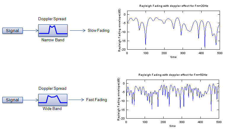
Doppler Spread
The last component I want to show you about Fading is Doppler spread. Doppler spread is caused by the well known phenomenon called ‘Doppler Shift’ (I would not explain what Doppler shift is. Everybody would learned about this from High school physics and you can easily google out a lot of explanation of this effect). Doppler spread can be expressed as shown in following function and plot. If you think of ‘Doppler spread’ as a kind of filter (or a block in a control system model). You can take the following function as a kind of transfer function of the filter. As you see, how much a frequency (fc) get spreaded by doppler spread is indicated by fm. If you see another formula below the graph representing fm, you would see fm is determined by the velocity of object (relative velocify between transmitter and reciever) and speed of light and fc(carrier frequency). You know fc is constant (set by standard and assume hardware is good enough to maintain the fc the same). Now the only variable is the speed v. According to this equation, fm and v are in proportional relation, meaning if v gets higher, fm gets larger (the width of the graph gets wider) and if v gets smaller, fm gets smaller (the width of the graph gets narrower).
Now you may have question. How differently the narrow Doppler spread and wide doppler spread affect on the signal ? The simulation result for these two cases (narrow and wide doppler spread) is shown below. The upper track is for narrow doppler spread and the lower track is for wide doppler spread. As you see, you see much frequency energy fluctuation over time in wide Doppler spectrum. I will update the page later about the mathmatical background.
General Concept of Fading Channel Simulation
Typical model for Fading channel can be described by a simple diagram as follows. This is very simplified model but fortunately this is almost enough for 3GPP specification for fading test. As you see, a signal comes into the fading block and splits into multiple path. Each path has three components, namely Delay, PDF, Gain component. By changing these parameters in each path, you can construct pretty complicated fading channel.
In LTE 3GPP specification, typical three types of Fading profiles are defined as follows.
Fading Channel Model Examples
Go through following pages (examples) and try to get some intuitive understanding on your own.
Reference
[1] Multipath and Doppler Effects and Models
|


Source: http://www.sharetechnote.com/html/Handbook_LTE_Fading.html

Leave a comment